

A short plug for the easy-to-use and easy-to-deploy (basic) work order management application from ESRI - Workforce for ArcGIS
Harnessing the power of Esri's Collector App

Contours
Contours are a great way to quickly view an area and get the feel for the lay of the land. And the better the source data, the more you can do with them, from reference to planning. Recently we used data derived from LiDAR to build a county-wide contour layer. The reason we went with LiDAR data is that the accuracy is usually much tighter (and more recent) than existing elevation information.

Contours created from LiDAR derived data
There are obviously different methods and tools to do this but here in Illinois we are fortunate; ISGS has done a fantastic job of working with counties and vendors to acquire LiDAR data, then process it and share it with the public through the Illinois Height Modernization Program. For GIS users the available data even includes prepared ArcMap documents with layers derived from classified LiDAR. Very nice. So with this information and some help from ESRI’s Contour raster function and Spatial Analyst, as long as processing power and disk space are available, you can build and fine-tune contours for fairly large areas.
It should be noted that LiDAR and elevation data can get pretty large in terms of storage space needed, not to mention any downloading or transferring of files. And you may find if working with larger areas, that processing data in parts or sections at time is necessary due to software limitations or time constraints. These things may pose challenges, to find the right fit for your needs and workflow(s). Overall however, this has been a great example of where open data meets ever-improving technology.
Take Control of your GIS

Illinois Roots for these Cowboys' Boots
Statue of Wild Bill Hickok in Mendota, IL.
Being lucky enough to be from the great state of Illinois and having a long lineage of ancestors who called the Prairie State home before me, I have a deep connection to the land and a pride of the heritage and history that the state embodies. While completing field work in the town of Mendota, IL, I noticed a large metal statue in the town square. Not ever being to the town before, I decided to go check it out. Upon inspection I learned that it was a bronze statue of James "Wild Bill" Hickok, a native of nearby Troy Grove, IL. This struck me as fantastic and I decided to dig deeper to see what other famous cowboys, lawmen, and sharpshooters were from Illinois.
I knew that the legendary lawman Wyatt Earp was born in and once called the Western Illinois town of Monmouth home, but I didn't know the vast connection of Wild West names that either were born in or spent time in the Land of Lincoln throughout the 1800's. Once i compiled a list of several men, I realized that I had to find a way to visualize my state's history that showed how interconnected it was to the vast frontiers and mountains of the American West. The best way for me to do that was by creating a story map via ESRI's ArcGIS Online story map builder.
You can view the map by clicking HERE. The process was relatively easy and pretty fun to put together. As you look at the map you will notice that the locations have one of three different colors for the tag: blue are for lawmen who once called Illinois home, red are for criminals that have ties to the state, and green is for a man of a completely unique professional background all his own.
Not So Lite Anymore
For the first few years, ArcGIS Online was considered ArcGIS-Lite by many of us (including me). Pushing data to the cloud without the need for a server was indeed huge, but capabilities were often not. Even down to the lack of labeling, it was almost extremely basic in many respects. However, those of us who have been using and following the platform have been impressed by the gusto with which ESRI has pursued the enhancement of ArcGIS Online.
Over the last couple of years we’ve seen improvements across the board, from symbology to data storage, from basemaps to analytical capabilities. For instance, data collectors can now take data offline where internet access is limited and sync up when convenient. Or how about related tables - editing related records via the Collector app is finally here. FINALLY. And that’s not to mention the continued improvement to web application templates (there are 24 now, and that’s not including Web AppBuilder) that require zero coding to setup. Even the help documentation is pretty fantastic these days.
So there’s A LOT to be excited about in the world of ArcGIS Online. But right now I’d like to focus that excitement on spatial analysis. You know, that fun stuff that got so many of us intrigued by GIS, but so few of us utilize in the real world. Well ArcGIS Online has had improvements to that side of things to. So what kinds of situations would you find spatial analysis useful? Maybe you’re unfamiliar with the concepts, or maybe it’s just been a while. So here are a few examples:
Proximity and Site Selection
Displaying areas or features within a specified distance from main roads
Displaying areas or features within a specified distance from a flood plain
Finding location(s) within an area containing a certain threshold of elderly population
Finding location(s) within an area containing a certain threshold of young professionals
Where can food trucks station based on local rules and regulations
Combinations of any two or more sets of parameters or specs
Analyzing Patterns
Determining areas with a high or low density of grocery stores
High and low clustering (Hot Spot Analysis) of owner-occupied land parcels
These are just a very small sample of uses. Using GIS to perform analysis adds the visual component to the results, or an extra dimension in terms of data. It not only looks cool, it helps with comprehension!
Completely Fictitious Example Workflow
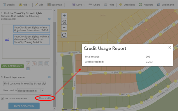
Let's say YourCity is interested in determining dimly-lit residential areas to allocate resources to. There have been a number of complaints and safety concerns, and now there is some funding available. So it is up to you as the GIS professional to assist using GIS as a tool to find and display the best areas to allot that funding.
In this case you are using zoning and streetlight information made available to you.
Step 1: Display Streetlights by Brightness Values
Symbols Sizes by Brightness and Classified by Natural Breaks

Step 2: Determine Residential Areas
Filter zoning layer to only display designated residential areas:

Step 3: Find Existing Locations
Use Find Existing Locations tool to determine where streetlights falling below a brightness threshold are near residential-zoned areas. This will use both an attribute query and a spatial query to produce a new layer meeting the specified criteria.

Step 4: Review Results

In this small, controlled area it is apparent and obvious where the targeted data fall. However in a larger area, it would be useful to further analyze these results to determine where clusters of dimly-lit areas are located. Those results could in turn aid in the decision making process regarding resource allocation.
Disclaimer: Two things you should always keep in mind - the quality and completeness of the input data, and choosing the appropriate boundary for your analysis, as changing the analysis extent will change your results.
Q: I have desktop. So why perform the analysis on ArcGIS Online? A: The same reasons that you use ArcGIS Online for anything – you can easily share the data through the web. You can dress it up in an application or presentation. And access it anywhere.
Q: What about service credits? A: No worries. First of all it’s not as bad as you might think. Second, you have a chance to see how many credits you will use before you pull the trigger. If it’s too much, you can back off or change your processing extent – but you’ll be surprised at how reasonable it is.
So there you go. Check it out, or ask someone who has. The spatial analysis capability with ArcGIS Online is here, it’s a great tool - and like the rest of the platform is constantly improving. Look for ways to answer your questions with GIS and add that spatial component that you can visualize and share.
Disc Golf
This started out as a simple smartphone GPS(GPX) trace. A trace to follow the route through a local course, which I could later add to my own map. Of course that map had to include the beginning and ending for each hole – tees and baskets. Nice! And easy! …Hmmm maybe way too easy. Decided to digitize the surroundings in ArcGIS for Desktop to really make the course stand out. Some of the data was available, but most of it did not meet the quality standards I was after – so I ended up becoming super-efficient at a variety of digitizing techniques instead. Note: I did and still do turn to Google Maps for reference in their top-gun imagery. In your face, everyone else’s imagery.
The first result was not bad, and caught the attention of the right people at the right time. It just so happened that a prominent local tournament could use such mapping for a few area courses. Sweet.
The first course, fairly refined. Washington Park, Washington IL
It's been great so far. Courses are a nice size for weekend projects, and contain a good variety of features to work with. Oddly enough, what I consider the biggest challenge to date has been depicting trees. When canopy is sparse, you can drop points to represent trees and shrubs, but that gets to be tedious rather quickly. And finding the best way to get those points to display at a quasi-relative circumference can also be WMTTD (Way More Tedious Than Desired). Other options used include tracing the boundary of thick canopy areas or my favorite, extracting them from DSM (takes a billion mouse-clicks off your finger, but you still spend enough trial and error time finding that perfect set of values that your default gdb looks like its ten years old).
Sneak peak of the temporary course at Eureka Lake Park, Eureka IL
No matter what methods have been used, a number of new tricks were picked up along the way that fulfilled certain needs and have made for easier going moving forward (hooray GIS). This has been a great example of utilizing the technology for a practical use while coupling it with an enjoyable pastime. Not to mention it will help in a small way to contribute to both the disc golf and local communities. Win-Win.
Centimeter Topo from 400 Feet

It is hard to deny that UAV technology is not going to impact many industries. With the lack of FAA regulation keeping commercial use grounded, gaining experience is hard. In an effort to test and develop our UAV imaging portfolio Cloudpoint Geographics has developed a solutions package.
Cloudpoint is striving to bring affordable imagery to industries such as mining, agriculture, engineering, and undiscovered markets. The value of affordable imagery that can be flown daily can help decision makers perform tasks by giving them tools to conduct stock pile volume calculations, topographic surveys, crop analysis, and many other needs. Cloudpoint's history as a geospatial solution provider allows us to use advance GIS and image mosaicing software to generate 3D deliverables.


How We Do It!!
Creating such results comes from combining various technologies to create a package. UAV's are just the flying platform and must be assisted by ground control, a good camera, and powerful processing software. Software algorithms, such as Agisoft Photoscan, are used to stitch photos to make a large mosaic as well as calculate elevations. This 3D model then can be exported as a point cloud, DEM, or one of many other formats. The imagery and 3D models created from images can then be used for many tasks such as volume calculations and Topographic modeling.

Real world Uses
- Daily Stockpile Volume Calculations
- Better Imagery for any situation
- 3D Building extraction
- DEM or Topo creation
Drones: A real game changer
First off: Drones have a negative connotation but are a great attention getter. The word drone has a negative feeling because of military accounts of spying and death. 90% of consumer drones are less than 5 lbs and are used mostly for a hobby (aerial imaging and photography). Fun fact = you will struggle to find drone manufacturers call their aircraft drones, they rather would call them a UAV because it does not have a negative view.
Phantom 2: Our first drone purchase was the Phantom 2. We went with a well known company (dji) so we could upgrade parts and drone bodies in the future. With our drone we also purchased a 2.4ghz datalink that connects the flight controls to an Ipad. Unfortunately this device was not made for the Phantom models. With a little modification and drone surgery, we attached the device to the main control board.
Camera: For aerial imaging, we were worried about the "fisheye" looks of many cameras people fly. We wanted a nice camera on a light drone. We had to take into consideration how we would mount it and the camera specs themselves, but especially weight. We ended up using a Ricoh GR camera that we mount to our drone using foam (vibration) and zipt-ties.
Processing: Agisoft Photoscan Pro is a great tool. It allows for stitching of images and calculates depth images to produce 3D models and DEMS. The stitching is so good that we do not need GPS on every photo, instead we just are using ground control. Photoscan was used for Orthophoto generation as well as 3d Point Cloud Extraction. Initial experiments have proved that precise measurement can be taken off the 3d models!

Processing POWER: Cloud processing provides a power without breaking the bank! The RAM dramatically helps in creating a mesh. It went from 16 hours to 30 minutes with the difference from 8gb.

Results: 3D models, DEM's, Orthophoto's, Video's, Building extraction, Point Cloud Generation, Etc.
Disclaimer: In compliance with FAA safety regulations, we flew the drone on private land and under 400 feet. We also complied with airport zone restrictions and the demo was used for internal (non-commercial) uses.
ArcPad - Customized not Commercialized
When looking for a solution to better their data and increase productivity, the city of Rock Falls, Illinois did not want a box solution. A city that has owned its own utilities (Including electric) for over 100 years, they did not want to change what practices were working to fit into someones package. The electric department spearheaded the efforts to implement a field GIS that would allow workers to update, edit, and view data. After looking at data privacy and structure, it was soon realized that ESRI's ArcPad was going to be the best solution.
ArcPad was decided upon for a few key reasons, but the ability to be customized to fit existing workflows made it the perfect solution. Because of offline editing, unique forms, and relationships, the city decided to pursue this unique route.

The city is using Lenovo touch screen tablets running Windows 8.1, allowing them to have easy field functionality. Custom toolbars allow them to filter and sort layers and custom forms allow for data population. The unique forms allowed for the city's electric department to tie all the attributes to the pole layer to replicate existing utility workflows.
Overall, the use of custom ArcPad solutions greatly benefited the city. It allowed them to keep existing workflows while capturing better and current data. Time was spent upfront on custom programming of forms and buttons for ease of use, but keeping it simple is the best way to get the field crews to adapt to it. Complex box solutions might "do it all" but getting buy-in from all users is key to making the overall project a success for years to come.
Creating Line Features in the Field (Snap!)
Need to create line features in the field? Grab a tablet, the Collector App for ArcGIS supports point, lines and polygon creation and editing. Wait, but what about connectivity? If the lines are created on a touch screen device they are going to be as accurate as…well as drawing things with your finger, right? No worries. If you have ArcGIS for Desktop Standard, you have the Snap tool available to you, which will help you out. Once you’re done making your field additions, you can bring the data back into Desktop and run Snap to ensure coincidence of features. You could just consider it the most useful markup method ever. (!)
Ingredients
AGOL Organizational Acct
Editable Feature Service(s) accessible on AGOL
ArcGIS for desktop Standard
Mobile Device
Before & After The red line was created in the field with Collector on iPad. The blue line has been snapped to the poles layer using the gp tool:
Important:Ensure vertices are added at (or near) every coincidence location while creating line features, as you will need them later for this process.
Note: This method may be possible without Organizational Account/Collector but is very likely not near as fluid.
Mobile Asset Management Solutions

A large challenge of a small business owner is to keep track of what is going on while being very involved in providing the service. A solution for this problem is asset management. Many asset management solutions can cost thousands of dollars in subscriptions and that doesn’t even include the cost of the equipment...
Mobile LIDAR: For Sign Inventories?

Not many people have heard of LIDAR (Light Detection and Ranging) until the Illinois DOT started flying counties to get topographic data and surveyors started using tripod based scanners to create detailed Topo maps. As the general public learns about the new technology, people are finding other uses. Mobile LIDAR is adapting the technology to a vehicle that can be used to collected data more efficiently and at maintains good accuracy. Because of this efficiency, Mobile LIDAR is becoming a standard for data collection.
Dondanville featured in Mobile GIS article!

Visit us at www.cloudpointgeo.com
Where is rain most needed? 2012 Illinois Drought Map
Here is a recent map of the severity of the current drought in Illinois. This map shows the lack of rainfall throughout the state for the month of June. We are currently obtaining additional data for the entire summer that will provide greater insight as to the hardest hit areas. Contact us for more details!
